The zippiest way to lay down stamped images is through the use of Stampin' Around Wheels. These come in two widths - standard and jumbo. Of course, since jumbo means jet, it is the faster of the two... Anyway, moving right along... For today's patterned paper, I'm using the Basic Outline jumbo wheel. This is a great wheel when combined with the Bud Basics stamp set since you can add lots of colours with minimal effort. No fussing with markers or painstakingly colouring sections of stamps whilst cursing the clumsiness of having an inkpad as a nib. 1. Run the wheel across the page (in any parallel direction) until the page is covered in impressions. An ink cartridge makes it easy to stamp continuous images from one side of the paper to the other. To break up the continuity of the empty vertical patch on the right side of the page (oops!), I inked a few dots from Itty Bitty Backgrounds and stamped a few times. It should not be so obvious in the next picture.
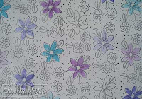 2. À la two step stampin' technique, use the base large flower stamp from Bud Basics to fill in the outlined large flowers. I've stamped twice with each inking of the stamp - if possible, the first impression on a whole flower so that I don't have a dark patch on the second impression. Leave a couple of the flowers white if you want a bit of lightness in the end product.
 3. Stamp with the base leaf stamp from Bud Basics next. The reason I do this before the small flowers is that I'm introducing two greens into the colour mix. The large flowers establish the major part of colour scheme and you are adjusting the color balance by the addition of the leaves (a little more yellow by using Gable Green, a little more blue by using Glorious Green).
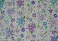 4. Stamp with the base small flower from Bud Basics over the small flower outlines. I've stamped three times with each inking of the stamp and left none white. I think the paper could be considered a finished product at this point (especially if you coloured all the flowers) but I'll add a little extra colour.
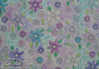 5. To add colour to the areas around the flowers and leaves, use a sponge dauber dabbed on an ink pad. The first tap on to your paper should be the lightest (imagine being a feather landing on the page). Increase the pressure of the taps as you go. Then, after re-inking, start lightly again. This avoids having really obvious round spots in the colour cloud surrounding the flowers and leaves.
Stampin' Supplies
Ink:
Basic Black ink cartridge
Gable Green
Glorious Green
Lovely Lilac
Orchid Opulence
Tempting Turquoise
Stamps:
Basic Outline wheel
Bud Basics set
Cardstock:
Ooooh! Non SU! white copy paper...
Accessories:
Jumbo wheel handle
Sponge daubers
It's all wheelie...I mean...really easy, right? I'm off to wrap something with it. I'll post the package tomorrow along with unwrapping the May Stampin' Up! offer.
Update 12:29pm
I've found out that there is another patroness also responsible for pointing visitors my way. Many many thanks Vivian Swain!
Wednesday, April 30, 2008
Rolling your own
Tuesday, April 29, 2008
All made up
Yesterday, one A5 piece of cardstock was freehand stamped into homemade patterned paper and then, overnight, it has been magically transformed in three cards. OK...I'm not that lucky but one of the following cards was trivial to make and the other two stepped up a little.
 The Trivial One
Cut the A5 cardstock (landscape) into half. Adhere one of the halves to a card blank. Top off with a framed sentiment.
Additional Stampin' Supplies
Ink:
Always Artichoke
Stamps:
Frames with a Flourish set
Warmest Regards set (retired)
Cardstock:
Whisper White The Stepped Up a Tad Card
Cut a piece off remaining patterned cardstock. Mat that piece on some white copy paper (less bulk). Assemble with a piece of distressed contrasting cardstock and embellish with hardware. Write greeting.
Additional Stampin' Supplies
Ink:
Always Artichoke
Stamps:
En Français
Cardstock:
Always Artichoke
Ruby Red
Accessories:
Pewter Hodgepodge Hardware
White Gel Pen The Stepped Up a Bit More Card
Use last scrap of patterned cardstock. I'm sure you can work out what to do if you are still reading this!
Additional Stampin' Supplies
Ink:
Always Artichoke
Stamps:
Frames with a Flourish set
Warmest Regards set (retired)
Cardstock:
Always Artichoke
Accessories:
Antique Brass Hodgepodge Hardware
White Grosgrain ribbon
For those who can see the dry embossing on the last card - this was done using a Cuttlebug in conjunction with a Fiskars texture plate.
Update 8:05pm
I'm dedicating the Stepped Up a Tad card to Allison to say thank you for linking to my blog. This generous act of hers has generated more traffic than I'm likely to ever see again. I should rename the card "Stepped Up a Lot" as a result. Thank you, Allison!
Monday, April 28, 2008
Patterned paper week
I love patterned paper and I'm choosing this week to feature it! More specifically, I'll be posting various ways of making your own and then using the paper in a project. That's like creativity squared ... or something. This is also a precursor to an upcoming May Stampin' Up! promotion but I'm going to stay quiet until then. Bribes may be considered, however ...
First up is the patterned paper you can create by stamping freehand. Choose your favourite stamp set and go for it on a blank piece of paper.
Tips
1. Make sure that you stamp over the edges of your paper so that the pattern doesn't look cramped (and the edges bald).
2. If you are stamping twice after inking once, be careful when you stamp off the edge on the first impression. You may find that the second impression has a darker patch of ink where the stamp met the edge of the paper on the first press.
3. Consider using contrived chaos. In other words, don't stamp with complete abandon - just look like you did. Stamp in clusters (such as in threes) and be careful with overlapping images as, while sometimes it can look good, other times it looks messy. 
Stampin' Supplies
Ink:
Old Olive
Ruby Red
Whisper White Craft
Stamps:
Bud Basics set
Cardstock:
Kraft
Accessories:
White Gel Pen
I found that the white craft ink didn't give me the shock of white that I wanted so I traced over the outlines with a white gel pen.
I'll post a project using this patterned cardstock tomorrow. But, in the meanwhile, have a squizz at Kari's bold and beautiful cards and Kylie's gorgeous offering - I reckon my patterned cardstock gives a similar feel to the Designer Series Paper that they used so well. Of course, the DSP is much more refined...
Saturday, April 26, 2008
Omitting Old Olive
My aunt asked me to make a birthday card for one of her friends who is turning 92(!) next week. Normally, my aunt is quite indifferent as to what elements should be included in the cards that she commissions. This time, however, she requested that the number 92 be prominently placed on the card. So, what better excuse is there for trying out some Stampin' Glitter? In addition to the numeric bling, the card has a couple of white eyelets set using a Crop-A-Dile and the embossing is courtesy of Cuttlebug Birds and Swirls and Birthday folders. A white gel pen was used to highlight the embossed sentiment.
Stampin' Supplies
Ink:
Sahara Sand
StazOn Black
Wild Wasabi
Stamps:
Oh, So Lovely set
Cardstock:
Blue Bayou
Lovely Lilac
Wild Wasabi
Accessories:
Basic Eyelets
Stampin' Glitter
Watercolor Pencils
I had considered using Old Olive for this card as I like it so much - it goes with all the cardstock that I've been reaching for, such as Rose Red, Chocolate Chip and, even, Kraft. But, in the interest of decorum, I decided to use Wild Wasabi instead ... as my aunt's friend's name is Olive.
Friday, April 25, 2008
Lest we forget
Dulce et Decorum Est by Wilfred Owen
Bent double, like old beggars under sacks,
Knock-kneed, coughing like hags, we cursed through sludge,
Till on the haunting flares we turned our backs
And towards our distant rest began to trudge.
Men marched asleep. Many had lost their boots
But limped on, blood-shod. All went lame; all blind;
Drunk with fatigue; deaf even to the hoots
Of tired, outstripped Five-Nines that dropped behind.
Gas! Gas! Quick, boys! – An ecstasy of fumbling,
Fitting the clumsy helmets just in time;
But someone still was yelling out and stumbling,
And flound'ring like a man in fire or lime . . .
Dim, through the misty panes and thick green light,
As under a green sea, I saw him drowning.
In all my dreams, before my helpless sight,
He plunges at me, guttering, choking, drowning.
If in some smothering dreams you too could pace
Behind the wagon that we flung him in,
And watch the white eyes writhing in his face,
His hanging face, like a devil's sick of sin;
If you could hear, at every jolt, the blood
Come gargling from the froth-corrupted lungs,
Obscene as cancer, bitter as the cud
Of vile, incurable sores on innocent tongues,
My friend, you would not tell with such high zest
To children ardent for some desperate glory,
The old Lie; Dulce et Decorum est
Pro patria mori.
Thursday, April 24, 2008
Make and take mistake
I recently (and rather excitedly) joined in a card swap with fellow INKlings arranged by my upline, Jayne. There were only a couple of guidelines set:
1. use a stamp set introduced in the recently released Idea Book & Catalogue,
2. and it should be straightforward enough for a "Make & Take" (where workshop attendees can all roll up their sleeves, make a copy of it during a workshop and take it home with them).
Not much to ask really...except that I experienced an nasty bout of self-doubt. What if the card I make is so awful that other demonstrators gag on seeing it? Or go blind and lose their ability to continue as demonstrators? I'd have deprived them of their joy AND their income. So, I thought and thought about what to make...and forgot all about rule number two. When I had finally finished the four copies of my card design, I went back to the INKlings forum to review the details (I know - a bit late!) and rule number two stuck its tongue out at me. Noooooo! Woe is me! Boho Backgrounds, from this day forward, thine name shall be Boohoo Backgrounds! To me, that is...
Anyhoo, I made another four cards which were not as fiddly and they are now on their way to Jayne. But I thought I might as well share the first set of cards with you. The Whisper White Craft ink is a revelation - the tiny flourishes look like they are white rub-ons since they sit on top of the surface of the cardstock. 
Stampin' Supplies
Ink:
Lovely Lilac
Rose Red
Taken with Teal
Whisper White Craft
Stamps:
Boho Backgrounds set
Carte Postale set
Cardstock:
Lovely Lilac
Rose Red
Taken with Teal
Whisper White
Accessories:
Stampin' Dimensionals
White Grosgrain Ribbon
Monday, April 21, 2008
Fridgey-ditch - the end of a cold relationship
Hot on the heels of my monitor going poof!, something short-circuited and tripped the safety switch during the recording of the last 10 minutes of a "Lost" episode (as if the show wasn't hard enough to follow as it is) . When we finally located the appliance causing the problem, it turned out to be our fridge. After serving for a faithful 36 years (a ridgey-didge fridge!), it had finally given up the ghost. RIP Westinghousey.
Being fickle creatures, we moved on by looking for a new fridge over the weekend. The new fridge arrived today - huzzah! but, as usual, there was a problem. The delivery person refused to remove our old fridge as it was a double-door model. He accused us of not telling him that this was the case. At this point, I just have to roll my eyes *roll eyes* It amazes me how it is always our fault for not doing someone else's job. I'm looking at you, refridgerator salesman!
Anyway, our old fridge is still with us even though we tried to get rid of it. And I thought I would post the following card that I am sure, when you squint and tilt your head, it looks just like a fridge - a double-door fridge just like Westinghousey. Stampin' Supplies
Ink:
Always Artichoke
Cameo Coral
Mellow Moss
Stamps:
Heartfelt Thanks set
Mostly Flowers set
Cardstock:
Always Artichoke
Cameo Coral
Mellow Moss
So Saffron
Very Vanilla
Accessories:
Pewter Hodgepodge Hardware
Cream Grosgrain Ribbon
Moss Gingham Ribbon
Mat Pack
Friday, April 18, 2008
Which way is up?
The great thing about circle stamps is that, whichever way you look at it, it is the right side up! This gives you flexibility in deciding what layout to use after successfully stamping a series of circles. Hmmm...landscape or portrait...diagonal perhaps? I can shimmy it over this mistake and presto! Perfect orientation.
This could be a bad thing in that the recipient may not know immediately where the card opening is.
card maker: *hand card over*
card recipient: *rotate* *fumble* *flip* *rotate* *smile sheepishly*
I suppose I could with live that.
Stampin' Supplies
Ink:
Basic Black
Gable Green
Real Red
Tempting Turquoise
Stamps:
Seeing Spots set
Cardstock:
Gable Green
Real Red
Whisper White
Accessories:
Silver Brad
Stampin' Dimensionals
Thursday, April 17, 2008
Screened out
Yesterday, whilst I was having a lovely time meeting fellow INKlings and learning about the recent Convention at my upline Jayne's training session, my husband pottered about on my computer at home and *POOF* my monitor blew! Well, that was his version of events anyway. The ending, however, was verifiable as my monitor was completely unresponsive to the super technical actions of pressing the switch multiple times with increasing pressure and the odd whack to the side of the case.
I tried sneaking access to my e-mail and blog on hubby's machine but it was rather obvious as he noticed that his seat was lumpier than usual (with me sitting there) and all his browser windows were open to stuff about craft. Anyway, crisis has been averted today as we swapped out my monitor with a tiny 15" that we had in storage that was marked for disposal. Yay to hoarding!
Oh! Almost forgot the real moral of the story ... since I had to log on directly to gmail (as opposed to downloading it through Outlook Express), I found some important e-mails had been lodged in the spam filter. This screen problem turned out to be a blessing in disguise!
Tuesday, April 15, 2008
Thinking of SU!
I've always thought of myself as a night owl. When I worked in Corporate Australia, I would struggle to get into work at a respectable hour - and I was always the last one in (of course, I made up for it by working late *blush*). But, ever since becoming a Stampin' Up! demonstrator, I find it easy to get up in the mornings...never more so than today. Expecting that three Stampin' Up! parcels would land on my door as soon as dawn broke, I sprang out of bed before 7am. That is a record for me! And there they were ... compelling reasons for being a reformed sleep-in-errer. New stamp sets, new tools (always smile at a Crop-A-Dile) and new In Colors.
So, the following card using my new Frames with a Flourish set, is dedicated to new SU! stuff being in my thoughts and getting me up in the mornings. Sad, huh?! 
Stampin' Supplies
Ink:
Chocolate Chip
So Saffron
Stamps:
Frames with a Flourish set
Mostly Flowers set
Warmest Regards set (retired)
Cardstock:
Chocolate Chip
Very Vanilla
Accessories:
Antique Brass Hodgepodge Hardware
Stampin' Dimensionals
Very Vanilla Grosgrain
Non-SU!:
Cuttlebug Stylized Flowers Embossing Folder
Sunday, April 13, 2008
A CASE, a colour challenge and ribbon
I was very impressed with a card that Belle recently made. I decided to CASE it for a colour challenge that was posted by Rebecca to keep us occupied whilst most demonstrators were in absentia (attending the Stampin' Up! Convention in Brisbane - lucky ducklings). The colours for the challenge were an amazing combination of rich and opulent hues with the crisp touch of black and white. To top off the card and celebrate Stampin' Up! ribbons, I tied on a little bit of black gingham ribbon. Oh yes! There was a lot of dotting with a white gel pen goin' on. 
Stampin' Supplies
Ink:
Basic Black
VersaMark
Stamps:
Carte Postale set
Cardstock:
Orchid Opulence
Pumpkin Pie
Rose Red
Whisper White
Ribbons:
Black Gingham
White Grosgrain
Saturday, April 12, 2008
Ribbons Galore
 Have you seen the latest range of ribbons by Stampin' Up!®? Other than the gorgeous Ribbon Originals which come in packs of 6 styles @ 1.8m length each, you can purchase ribbons by the roll. The striped grosgrain ribbon is perfect for sporty cards and layouts - reminds me of the trim on sport socks!
  The double-stitched ribbon is a perfect complement to the new range of In Colors. And, as usual, the grosgrain ribbon matches a range of colours from the four classic Stampin' Up! colour families ... with the new addition of wider ribbon for greater impact. I've made up a ribbon sampler of these ribbons to show people how they look and feel in real life - so book a workshop with me and you can experience them in their full galorey ... ie glory!
Thursday, April 10, 2008
Spot the difference
The difference is day and night! This is the same card as in the previous post (no kidding!) - only taken during day without my ham-fisted attempts to adjust the lighting. I've learnt my lesson...don't do tonight what you can do tomorrow (in daylight, that is).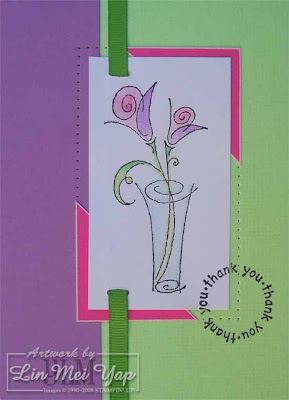
Wednesday, April 9, 2008
Flashy Sassy
I've only just finished making this card. As it is evening, I had to use a flash to take a photo of it - which always causes colour fidelity problems. I then spend ages fiddling with it in Photoshop to remove the additional yellow ... and then over edit the thing. *sigh*
In any case, this is the first card that I have posted using Sassy Stems. This surprises me as it is one of my favourites. The colour scheme is a little radical this time as there is a rather abrupt change of pace from the pastel Green Gable to the vivid Pink Passion cardstock and Apple Green ribbon. Also, as I didn't like the look of Pink Passion directly on Orchid Opulence, I used a white pigment ink pen to outline the Pink Passion corners. What do you think of the end result?
Stampin' Supplies
Ink:
Basic Black
VersaMark Stamp Pad
Stamps:
Canvas background
Sassy Stems set
Seeing Spots set
Cardstock:
Gable Green
Orchid Opulence
Pink Passion
Whisper White
Accessories:
Apple Green Ribbon (retired)
Mat Pack
Watercolor Crayons in Bold Brights
Monday, April 7, 2008
Au lait!
The shackles of being shaped have been lifted! To celebrate, I'm posting a milkshake shape - a tiny milk carton specifically. Made for a team challenge, this is based on a tutorial by Beate Johns. The repeated words on the label took a lot of Stamp-A-Ma-Jigging! As usual, I couldn't resist using a scalloped edge die cut and my trusty Cuttlebug Textile embossing folder for added texture.
Stampin' Supplies
Ink:
Chocolate Chip
Not Quite Navy
Sage Shadow
Very Vanilla Craft (retired)
Stamps:
Carte Postale set
Leaves à la Carte wheel
Cardstock:
Chocolate Chip
Not Quite Navy
Sage Shadow
Very Vanilla
Accessories:
Chocolate Grosgrain Ribbon
Stamp-A-Ma-Jig
Sunday, April 6, 2008
OMG! We've been shaped down!
Hubby and I are normally sitting pretty on our broadband plan. He has a little gadget on his desktop which shows our daily usage and we usually track just under our quota. But, just yesterday, we blew our limit and we've been shaped...for one-and-a-half days! Using the internet is now like watching grass die (which, in turn, is like watching grass grow...only sadder and accompanied by a lot of wailing). On the bright side, it gives me a chance to make something today.
For 80s children out there, this is to the tune of Bob Seger's Shakedown from Beverly Hills Cop 2:
Shaped down
Breakdown
Takedown
We just used too much of the crowded line
Shaped down
Takedown
We're busted
Let down
Our guard
Honey, just about the time we're thinkin' it's all right
Shaped down
Takedown
We're busted
For all others, the original. PS It only took half an hour to download at dialup speed.
Saturday, April 5, 2008
Daylight Saving Leaves
Yep! It is that quirky time of year when we have Groundhog hour ... where we, in New South Wales, get to experience 2am till 2:59:59am twice in one day. This is the payout we get for surrendering the extra hour last year when daylight saving started. But I want to know where is the interest? Don't we get 10 minutes extra for saving these six months?
Here is a card full of leaves - in honour of daylight saving leaving:
Stampin' Supplies
Ink:
Basic Brown
Stamps:
Artfully Asian set
Cardstock:
Barely Banana
More Mustard
Whisper White
Accessories:
Antique Brass Hodgepodge Hardware
Cream Grosgrain Ribbon
Stampin' Dimensionals
Watercolour Pencils
Thursday, April 3, 2008
Just in CASE: a CASE in point
Sometimes, when you haven't got much inspiration and you are short of time (birthday party tonight!) and you really want to give a handmade card, you may just have to CASE. There are a few versions of what CASE stands for (mine is Copy And Somewhat Edit) but essentially it means basing the layout of your card on one that you like and changing it to suit your preferences and supplies.
Last night, my upline, Jayne, posted a challenge to CASE from a random page in the new Idea Book & Catalogue. Mine was from page 87 and the result was:
Stampin' Supplies
Ink:
Orchid Opulence
Tempting Turquoise
Stamps:
Carte Postale set
Seeing Spots set
Cardstock:
Orchid Opulence
Tempting Turquoise
Very Vanilla
Accessories:
Light Orchid Grosgrain Ribbon
Turquoise Grosgrain Ribbon
Mat Pack
Stampin' Dimensionals
As I did not have the new scallop punch, I had to make do with two flowers cut using a Spellbinders Flower Creations Die. Also, a Cuttlebug Circle Die was used in place of the Stampin' Up! 3.2cm circle punch (my defense is a 3.2cm circle is a 3.2cm circle!). I embossed the turquoise flower using a Cuttlebug Textile Embossing Folder just to differentiate the flower a little from the turquoise background.
Tuesday, April 1, 2008
Happy SU! Year
 It's New Year's Day for Stampin' Up!® in Australia. And with the new year comes the new 2008-2009 Idea Book & Catalogue containing new stamp sets, new In Colors (yes SU! is an American company), new accessories and, most of all, new inspiration.
The 2008-2009 Idea Book & Catalogue has an RRP of $12.95. I'll include a link to the new online version as soon as it ... well... comes online. I've also started a new e-newsletter - sign up if you'd like to check it out as the first instalment will be available as soon as the new catalogue can be linked to. The newsletter details a special on the catalogue for any intrepid subscribers.
Happy SU! Year!
Update 12:10pm: Yay! 2008-2009 Idea Book & Catalogue is now online and so is my e-newsletter.
2008-2009 Idea Book & Catalogue Corrections & Write-Ins
The following changes apply to the 2008-2009 Idea Book & Catalogue.
Catalogue Corrections
| Page | Item # | Item | Correction |
| 79 | 108755 | Blossoms Abound stamp set | The Blossoms Abound stamp set is a Two-Step Stampin' set. The logo was omitted. |
| 88 | 104401 | 1-3/8" Circle punch | The punch at the bottom of the page is misnamed. The item code and price listed are for the 1" Circle punch, not the 1-3/8" Circle punch. |
| 132 | 106588 and 106589 | C6 envelopes | These items include 40 envelopes per package, not 20 as printed. |
| 132 | 106523 | Five-in-One Card Cover | The image shown is incorrect. The following image is correct. |
| 146 | 109035 | Always Artichoke 1/4" grosgrain ribbon | Swatch shown is incorrect. Always Artichoke ribbon coordinates with Always Artichoke card stock and ink. |
Catalogue Write-ins
| Item # | Item | Price | Description |
| 106686 | Spring Flowers Designer Series paper | $11.95 |  |
| 106685 | Spring Showers Designer Series paper | $11.95 |  |
Discontinued or Temporarily Unavailable Items
| Page | Item # | Item |
| 132 | 101307 | Gift Cards & Mini Envelopes Now available as 107312 |
| 148 | 103280 | Embossing Kit |
| 151 | 105525 | Forget-Me-Not-Keeper |


